Saturday, 28 May 2016

How to choose the right area rug

People have been using rugs since the earliest days of history. Initially they were made of animal skins and served very functional purposes. Today this functional role has been replaced  by a purely aesthetic one.  Rugs  have several purposes in home decor:  they add texture and colour to a room;  they establish zones in large rooms;  they anchor furniture and complement a colour scheme or other elements.    

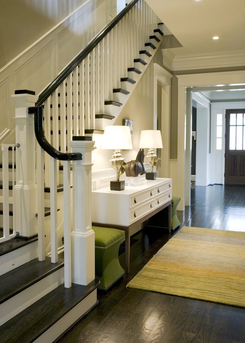
The size of an area rug dictates how you will use it in your home. Smaller to mid size rugs ( 2’X3’, 3’X5’ and 4’X6’) are used to highlight or accent other features in a room.  They are used effectively in a bathroom, kitchen, entrance or hallway or

living room contemporary living room

....... in a living room it seems. 


Modern Classic contemporary entry
Jona Collins

There's no doubt that this small but dramatic area rug completes this space.  


Stair  staircase
Brian Watford ID

This is another example of a well placed small rug that enhances the other items in the space.

Larger size rugs (6’X9’, 8’X10’, 9’X12’ and 12’X15’)  are used in living rooms and dining rooms. It is also possible to order irregular shaped rugs or have carpet bound to fit any size you request.

Full coverage 

If you are dealing with flooring that is not up to scratch or you dislike the tone of your flooring you can opt to cover  the problem with an area rug. In that situation you should aim to have your rug anywhere from 1 to 3 feet  from the walls to allow you to see the flooring underneath.  If you have a fireplace or closet protruding into the  room you should use this as your "wall" and measure from it.

Dining Room Rugs

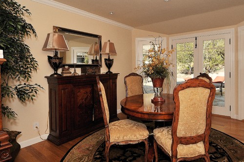
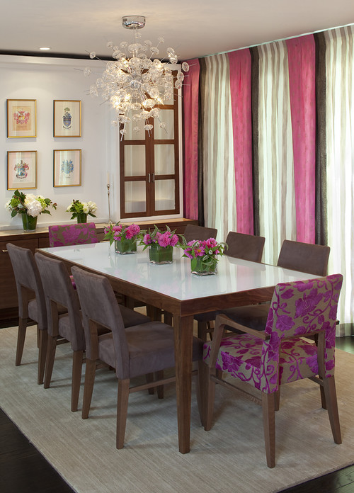
The most important aspect to consider when you are buying a dining room area rug is the size of your table and how far a chair extends when you pull it out.  There's nothing more annoying than always catching the leg of a chair on the edge of a rug or having an uneven seat because two legs are on the rug and two are off.  A general rule of thumb for determining a minimum rug  size for your dining room is to extend your rug at least two feet beyond the edges of your table.If your table is three feet wide the width of your rug would be need to be at least 7  feet wide.  The next standard size would be 8 x 10'.


source

This is obviously a custom rug because it fits the dimensions of the table perfectly.   

Debra Campbell Design traditional dining room
Debra Campbell Design

The shape of your rug should also mimic your table shape- round with round, oval with oval etc.

Living Room Rugs

In living rooms rugs usually establish conversation areas.  Depending on the size of your space you may have one or more areas to define.   If you have an open concept home,  rugs can  break up the larger space into both a living and a dining area.

Case Design/Remodeling, Inc. traditional living room
Case Design/Remodling

Forest Manor Model Home modern living room
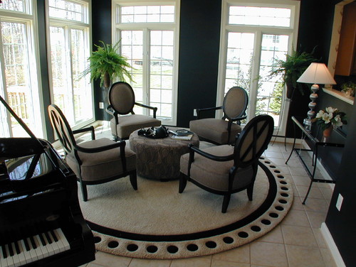
I'm imagining that this is one end of a larger space. I love the repetition of circular shapes and the black and white scheme.  The circular shape  of the rug mimics the chair layout and the ottoman. Who wouldn't want to have a glass of wine here?

Let's look at some of the size and placement guidelines in living rooms.

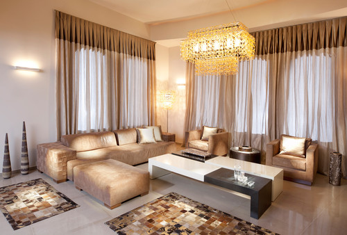
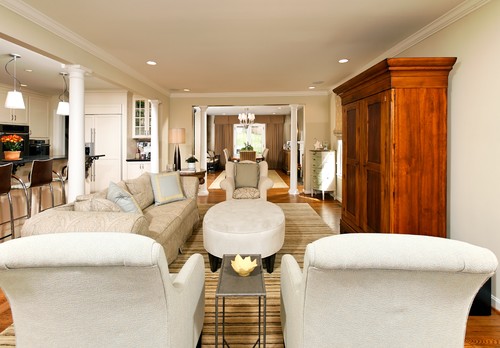
If you want your sofa and chairs to rest on the rug it should extend at least a foot beyond the back of the sofa. 

Austin Patterson Disston Architects traditional living room


 Country Living

 You can also purchase a smaller rug that allows just  front legs of the sofa to rest on it.  This is one of the options for a 6 x 9 rug.


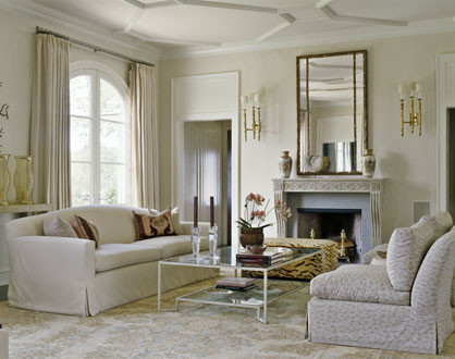
Smaller rugs like 4 x 6' work well under a coffee table. These would float under the table and function as a separator between the table and the floor.  If your table and flooring are close in value (both are dark or light) an area rug is highly desirable to show your table to best advantage.


This is such a happy room!  Only the tables are dark,  the area rug follows this trend and adds only design and texture.


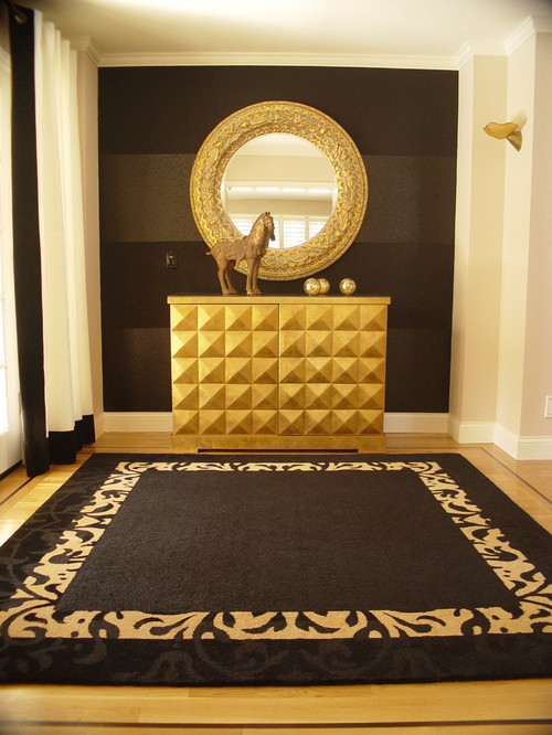
This small area rug provides an additional  way to add an accent colour in the room.

Bedroom Rugs

 If you are using a large rug in a bedroom it does not need to be centered. Consider having the same amount of floor space on two or three sides of the rug. Often rugs are used to highlight the placement of the bed. In this application a highly patterned rug would be  wasted because much of it would be under the bed.

Traditional furnishings translated to a transitional look eclectic bedroom
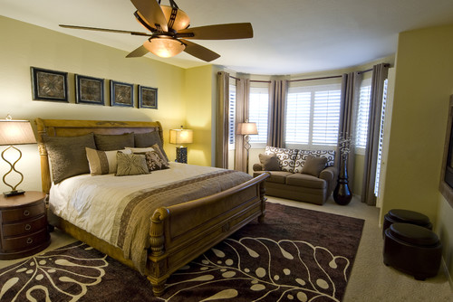
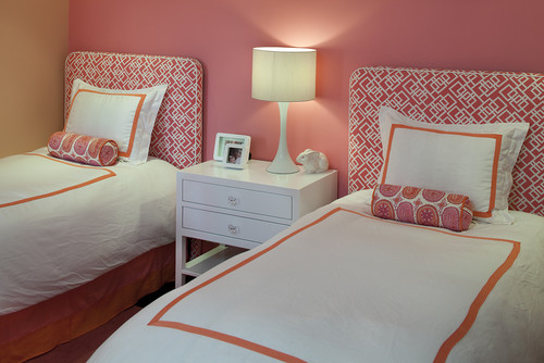
While there is a pattern on this rug the scale is large and it shows well.


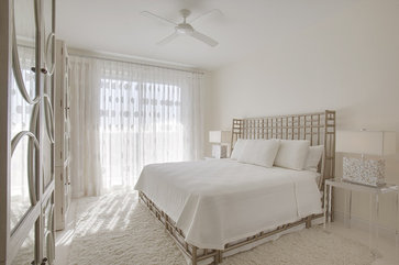
A totally monochromatic room depends on texture to be successful. The area rug just had to be shag.

Did you notice another trend running through most of these photos?


Purple Love

Purple is a colour that inspires passionate reactions. You either love it  or hate it.  In my case,  I love it.  I'm always surprised by the strong reaction  I receive when I mention any tint or shade of purple as a design solution to clients.

Purple combines the tranquility of blue with the excitement of red. It is said that purple is associated with non-conformists such as artists or designers.  It draws out intuition and encourages creativity. Shades of purple are restful and comforting and can often be found in religious symbols.  Purple has long been a symbol of royalty and mystery.

 So where can you go with purple in decorating?

Purple can be used as a complete envelope for a room. 


You have to really love purple to take this approach to its use. Even when grays and white are added in,  there's still a lot of purple. 


 This room depends almost totally on purple.  Much too saturated for my tastes, and I think one would tire of it quickly. There are lovely accents here that could be added into other schemes.


While there's still a large percentage of purple in this room, the softness of the colour provides a calming backdrop for living. Purple and brown work well together and it is a combination rarely seen.


Playing it safe with accents.....


The drapes in this room provide a great backdrop for the  green bedspread. I find spring greens and purples particularly pleasing to the eye.  


Soft and playful..... 


Going a little wild......
 
One of the strengths of a neutral palette is the option to use a really strong splash of colour with it.  This ceiling is daring and inspired and makes this toned down decor rich and exciting while working well with the purplish gray cabinets and table.  The additional hints of purple around the room help to anchor the colour.


A splash of purple in an area rug and a gentle hint in a pillow ties this room together. In this room the art is on the floor!

 For those that truly love purple, check out The Purple Store.


Think pink in 2011

For more than a decade, Pantone's Colour of the Year declarations have influenced product development and purchasing decisions in multiple industries including home  design.  This year's Pantone colour is.....

Honeysuckle 
Pantone Colour Institute Executive Director Leatrice Eiseman says, "In times of stress, we need something to lift our spirits. Honeysuckle is a captivating, stimulating colour that gets the adrenaline going-- perfect to ward off the blues."  Yes indeed, Honeysuckle is that kind of pink, but there are many  tints and shade of pink that are options in decor.Perhaps there's one for you.

source
Vibrant all the way.  You couldn't help but feel upbeat in this room.  Some rooms have so much colour energy they are difficult places to relax.  Personally, I love a room that soothes and this space would not be my first choice.  How about you? 

source

A subtle and understated pink creeps quietly into this decor and settles in place. It produces a quiet, relaxed environment that calls you to curl up with a nice book.

source

Another quiet pink combination that  works well for  relaxation.  The pink/ brown combination is one of my favourites and recently it is a popular  colour scheme for children's rooms. 


source 

Anything with gray is bound to be a favourite with me. I love the way grays are  the supporting actors in a room , letting other colours do their thing.  Gray is the new neutral, but it has been my neutral since the mid 80"s


Tineke triggs contemporary bedroom
tineke triggs


Orange and pink are a somewhat unlikely pair, but they work well together especially when one dominates. 


Oatmeal and pink  which is moving subtly toward coral  makes a fantastic duo in this Sarah Richardson design. 


source

Yellow is another colour that you don't often see paired with pink, but it is one of my favourite combinations. The addition of orange makes this an energetic combo without being too much so because of the light colour on the walls. If I could make one change in this room,  I would paint  the walls a more neutral colour.

Tineke triggs contemporary dining room

I love the chairs.  Enough said. 


Kitchen, bath, office contemporary kitchen

This room combines two 2011 trends, honeysuckle and pattern.
 
What's your tolerance level for pink in decor?

Tuesday, 24 May 2016

Design trends for the new year

This time of year many design blogs and magazines present trend forecasts for the coming year.  They are interesting to read, but one has to recognize they are best guesses based on the knowledge and intuition  of the individual writer or design group.


On every newstand this month you'll see design magazines with design trends a prominent feature on their front covers. On closer inspection you may find there isn't a great deal of overlap from article to article and you have to work to piece together exactly what the trends are.  Exploration online offers almost too much information on the subject and the sheer quantity boggles your mind, but I keep reading.   Over the next several posts I'll  explore the  trends that appeal to my design aesthetic. 

Re-purposing 
This is a continuing trend from 2010 and I predict with the focus on everything green it will continue well into the future.  Finding creative ways to use what you have or to recycle furniture and objects from other sources  provides satisfaction on many levels. Re-purposing will be combined with buying new to develop a more unique, individual look that has a history. 

photo: Margaret Ryall
 artwork:  Will Gill  
This wicker chair acquired from a second hand store is one of my favourite pieces of furniture. I was attracted to it because of its unusual shape and I could see  beyond the horrible orange wicker and brown seat pad.  After four cans of spray paint it took on a new life.

I like a comfortable, more casual feel in my home,  therefore re-purposing has always been part of my design approach. I'm on the look out for a new chest of drawers to replace my sad little wicker set which is lost next to the chair. Then a  long overdue reorganization of this  space will be necessary.  The hunt is part of the fun.Yes, decorators have design problems like their clients and solutions need patience.


Sculptural White Objects:
The simplicity of grouped white pottery and sculpture has always appealed to me and I've used this interest in different ways over the years.  Finally it's a trend according to Canadian House and Home!


photos: Margaret Ryall


White vases to covet.....


Check out the attic and the back cupboard, talk to your family and friends. Perhaps you can re-purpose white objects into a beautiful grouping.

Dining room solutions

In January during a blackout our pipes broke resulting in water damage to a number of rooms in our home. What was a bit of a disaster turned into a positive for me because it finally got me moving to do something about  one of my biggest decorating problems.  That would be my dining room.... See my complaints in this  post .  It's quite a list. 


Too much of a good thing


This is how it all looked  in early 2000 .....

problems furniture arrangement dining room
Wood, wood and more wood


Problem lines  

Wood everywhere isn't the only problem.  Note the all the horizontal lines from the buffets to the railing,  a light hung too high and a window that has a view of the window next door.   Below is my first attempt to solve some of the highlighted problems.


arranging dining room furniture
 A different orientation solves some problems

Rearrange and add


I liked the changes and that satisfied me for a short time.  The new light was a good height and the roundness worked well against all the rectangles.  I also added longer (very temporary and too short) drapes to break some of the horizontal lines.    I moved the art work from  the living room to dining room,  and created some height and brightness on the dining table.  Still seriously problematic in my book because I did nothing to alleviate the wood issue, but it was improved but sorely lacking  pizazz.

Enter 2014... 

The power of paint and fabric

One of the cheapest updates you can make to any space is to paint something.  I don't care if it is furniture, accessories or walls, it works every time. Since we had to repaint all the walls (BM Glacier white) I continued on to paint quite a few things which I will reveal over the next several posts.  


painting upholstery dining chairs gray circles
 Bringing  it into 2014


To break up the wood and the set,  I was determined to sell all the dining chairs and buy new ones. I still don't know how I got hubby to agree to selling 8 hand made solid ash chairs because they were too matched. He was probably fed up listening to complaints!

After an extensive search,  I realized the chairs that looked best with the table  were the ones my husband made for it. I don't like sets, but in this case I had to concede.  So ... after much discussion with sister and daughter and varying opinions, I found a fabric I loved and then choose spray paint to work with it. 

I would like to say that cleaning and spray painting 8 chairs was exciting.  Not so.... But I got to use my favourite motif (circles) and my favourite colour gray. What could be better!   Part 2 coming soon... new problems and solutions. Hint:  Look at the vignettes on the buffet and table.

What do you think?