Monday, 31 October 2011
Holiday colours
Are you a person who sees certain colour combinations which immediately evoke holiday connections, e.g.,red and green, orange and black, yellow and purple? I am, and as a result there are colour schemes I find difficult to live with because the cultural connections override the beauty of the combination. But sometimes a combination sneaks by me.
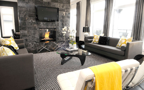
I took this photo in the main area of a small London hotel. I loved the modern flavour and the strong vertical stripes. My immediate reaction was not Halloween, it was great impact. Later I realized they were symbolic colours.
What's your reaction?
Saturday, 29 October 2011
Mirror, mirror
I keep a list of ideas for possible post topics and near the top is an exploration of mirrors in home decor. Well, that's one post I won't be writing because one of my favourite decorating sites, Your Decorating Hotline, has an excellent post on this topic. It covers the gamut from why use mirrors to the creative ways they can be used. I highly recommend reading it. There's something for every style of decor.
One of the topics explored is the use of mirrors in multiple groupings. This is an application that I'm particularly fond of and I've added several from my file below.
Elle Decor has an excellent slide show on using mirrors and
Apartment Therapy brings multiple mirrors to the limit.
Did you find something you liked?
Thursday, 27 October 2011
Thursday Tip #6- simple centerpieces
Keep it simple...
Dinner parties can stress the budget. I like to have simple arrangements for the table and that usually involves fresh flowers . Rather than large bouquets which are tall and obstruct views, think about simple ways to use flowers or leaves in a repetition.
Hosta leaves are one of my favourites and I have lots to choose from in my garden. I love the idea of massing different sizes and shapes of glasses/vases and submerging separate leaves in each one.
The sunflower is a great choice for fall entertaining. If you don't have access to fresh sunflowers, there are realistic looking artificial ones. The arrangement above works because of the meandering wave and colour variety.
Tuesday, 25 October 2011
It's all about scale
In recent weeks I've spent quite a bit of time looking for coffee and end tables for clients. Getting the style and size right to work with the rest of the furniture in the space takes quite a bit of juggling and an understanding of standard furniture sizes.
The standard height of a coffee table is between 16 - 18 inches, but some can be as high as 21 inches. How do you know which height to choose?
The answer relates to the height of the sofa/ chair. I prefer to see the coffee table about the same height as the top of the chair cushion or one or two inches lower. The length of a coffee table is usually about 2/3 the length of the sofa not including the arms. Don't forget that you need at least 18 inches (24 is optimal) of space for your legs between a coffee table and the sofa.
The size of your coffee table should work with your sofa and other furniture in your room. It should also work with the size of the room overall. Let's check this out.
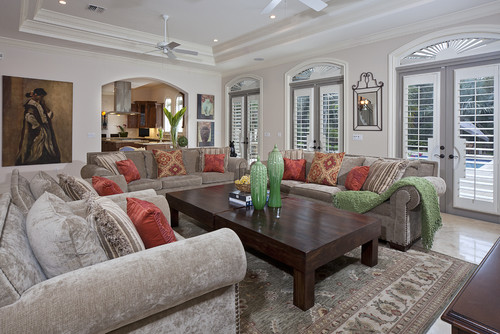
How do you feel about the coffee table choice in this lovely room? I would like to see something longer (remember the 2/3 the length of the sofa rule). This little beauty is having a difficult time holding her own with this sofa.
The soft colour scheme and small scale furnishings in this room appear overwhelmed by this large, dark, and tall coffee table, but I really like the table. Sometimes the weight of a table is influenced by the colour and material choice not just the overall dimensions. Darker colours and solid woods tend to look more visually weighted.
Even with two tables this room does not look over furnished.
If your room is spacious and/or the furniture is large in scale, choose heavier wood tables or ones with lots of tiers or drawers.
The standard height of a coffee table is between 16 - 18 inches, but some can be as high as 21 inches. How do you know which height to choose?
The size of your coffee table should work with your sofa and other furniture in your room. It should also work with the size of the room overall. Let's check this out.
How do you feel about the coffee table choice in this lovely room? I would like to see something longer (remember the 2/3 the length of the sofa rule). This little beauty is having a difficult time holding her own with this sofa.
Grisell Navas
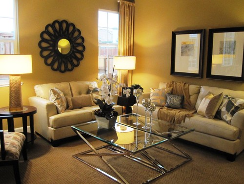
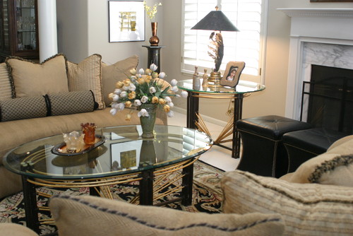
Don’t forget the size of the room when thinking about scale. Glass tables work well in smaller rooms because they give the impression of lightness - space is not blocked out.

Even with two tables this room does not look over furnished.
If your room is spacious and/or the furniture is large in scale, choose heavier wood tables or ones with lots of tiers or drawers.
This is a beautiful room with a colour scheme I'm partial to. Does the coffee table work for you? I wouldn't want to try to place something on the table while sitting. I'm such a stickler for function!
Friday, 21 October 2011
At Home: An ocean getaway
As a child I often imagined how a house would look on the inside as I drove or walked about the town where I lived. I'm assuming I'm no different from most people. My Open Doors series of posts will fill the need to peek inside everyday homes- not the grand designs of decor magazines, but interesting homes that are achievable for most people. Come along on a visit to my friends' ocean beach house.
After one visit to the Bonavista Peninsula , Pat and Janna fell in love with the place and purchased a typical Newfoundland outport house and began to remodel it. Remodel doesn't seem the right word though. They worked backward until they reached the original boards, removing layers of wallpaper and wallboard. I was lucky enough to photograph some of this process for my wallpaper archive which is part of an art project I'm working on. Here's what it looked like then....
And look what was hiding under the layers of wallpaper, a newspaper article about The Kennedy family. After much patience and elbow grease they were ready to simplify the decor.
They painted the whole interior white and added their personal touches. That's what makes a home in my book. I appreciate the way they have arranged/displayed their finds.
Most of the furnishings are from IKEA which is a feat when you live in Newfoundland- they have to be shipped or driven. I covet the aqua coloured lantern on the bookcase. Would they notice if it wasn't there next summer?
I love seeing the remnant of an old window (I'm guessing) above the left chair. Shutters are a very practical window treatment because these windows are visible from the street and there could be nosy people just like me hovering outside.
I call this the gallery of "Walked On" . Pat salvaged scraps of the various floor coverings from the house and framed them in simple IKEA frames. The stark simplicity of the frames show off the contents. Keeping the stairway all white further enhances the overall look of this very effective display.
The patio overlooking the Atlantic Ocean has lots of beach finds. There's a wind up today.
From the kitchen looking out through the screened window. Even I would like to wash dishes here. The exterior of the house is red with a soft creamy white trim.
Pat and Janna travel all the way from British Columbia to Newfoundland every summer to enjoy life on an opposite ocean. I met Pat when she and a friend came to visit my studio/gallery in my summer house. Ever since we've been looking forward to our summer time visits. When they left this year I received a key to the premises so I could photograph.
And look what was hiding under the layers of wallpaper, a newspaper article about The Kennedy family. After much patience and elbow grease they were ready to simplify the decor.
They painted the whole interior white and added their personal touches. That's what makes a home in my book. I appreciate the way they have arranged/displayed their finds.
The accent colour throughout the house is red. What a fitting use for these cod jiggers!
Sea urchins in a bottle, beach glass, a boat and sea birds on an old trunk flanked by windows and oars.
More splashes of red against white and navy blue. The sofa is red, but it was covered for its winter rest.
Some of my favourite things in the house... the checkerboard that has two colours of beach stones for checkers, and a book about sea glass which prompted me to get my own copy. It just arrived and I'm reading every word getting ready for next summer's hunt.
Most of the furnishings are from IKEA which is a feat when you live in Newfoundland- they have to be shipped or driven. I covet the aqua coloured lantern on the bookcase. Would they notice if it wasn't there next summer?
I love seeing the remnant of an old window (I'm guessing) above the left chair. Shutters are a very practical window treatment because these windows are visible from the street and there could be nosy people just like me hovering outside.
I call this the gallery of "Walked On" . Pat salvaged scraps of the various floor coverings from the house and framed them in simple IKEA frames. The stark simplicity of the frames show off the contents. Keeping the stairway all white further enhances the overall look of this very effective display.
Upstairs hallway leading to....
..... a great desk area . Now where did they find that old map of Newfoundland that was on the school room wall in my day?
There are more rooms for another time, but I ran out of battery power before I could finish my job. Do you have any favourites?
Thanks to Janna and Pat for leaving me with the key and welcoming my intrusion.
Thursday, 20 October 2011
Thursday Tip #5- Use geometry
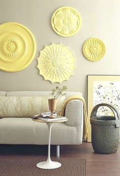
Most furniture is predominantly rectangular. When you're adding accents it's good to include circular shapes to play against the strong horizontal and vertical lines. The basket, table, wooden goblet and medallions work wonderfully with this sofa (which is not as squared off as most). There's also lots of texture in this room. If you can't count at least five different textures in a space it is probably not that exciting! You rarely see beige paired with yellow, but doesn't it look fabulous? In case you didn't notice.... spray paint medallions meant for ceiling applications and use them as wall decor.
Sunday, 16 October 2011
Seen through a window
Travelling allows you to broaden your horizons in many ways. You get to experience different cultures, climates, foods and transportation systems. While many things stay the same from country to country, there are also subtle differences in many of these areas. One of my favourite things to do when I am walking in a new city is window shop with my camera. Here are shots from Munich and Prague that relate to interior decor. Hope you see something your like.
Bling is in and the metal of choice appears to be chrome with lots of crystals....
Bedding inspired by nature and the fall season was everywhere.
Fall table settings
Purple is popular.
And quirky clocks are always fun. Sometimes you even get a surprise when you take a shot. I'm looking in and out!
Thursday, 13 October 2011
Thursday Tip #4- Layering accessories
Laura Martin Bovard
What do you have in your house that your friends don't have? What personal touches make your house into a home? Accessories may be small but they have a big punch in decor. This is an area where you should strive for personality plus. Choose things that mean something to you or your family, and then combine them to make an interesting grouping. Forget about spreading things out along the top of a cabinet or mantle- group, group, group.
Why does this vignette work?
- the colour tones are very similar
- there's a variety of objects, textures, shapes and sizes (love the sphere)
- the objects are layered forcing you to look through to the back (providing a visual journey)
- the art work is overlapped , but you can still see each piece
- the format of the vignette is a classic v shape with the height at the edges and the lowest point near the middle
Saturday, 8 October 2011
Not the same old doors
Comparisons are easy when you are an interior decorator. You get to visit different homes build at different times, with different styles. One feature in home decor that rarely has much variety (at least where I live) is interior doors; most are white with raised panels and round knobs. Pretty understated, pretty boring, but it doesn't have to be like that. Let's look at some options.
Paint them dark
Paint is one of the cheapest solutions for making your doors standout and invite. If you like drama go for dark. Stick to painting the doors only and keep the trim colour neutral unless you have a very high contrast look going on. Dark trim colour outlines a room.
I love this door painted Benjamin Moore Overcoat CC 544 in Cameron MacNeil's home because it is a destination for the eye.You have no choice but pay attention to it. The four pieces of art work hung vertically add to the overall look of the space. It's easy to get away with a dark door if you have glass in it and if it is a front or back door. I prefer dark charcoal doors to black and my favourite colour is Benjamin Moore Iron Mountain (2134-30).
House and Home
Solid black doors are more imposing and double doors painted a dark colour beg to be noticed. In this room the floor colour supports the black scheme. The rectangular hardware adds interest too. There's nothing as boring as a stainless round knob.
And stencil it
Check out the other 24 ideas on this blog for black doors.
Paint them bright
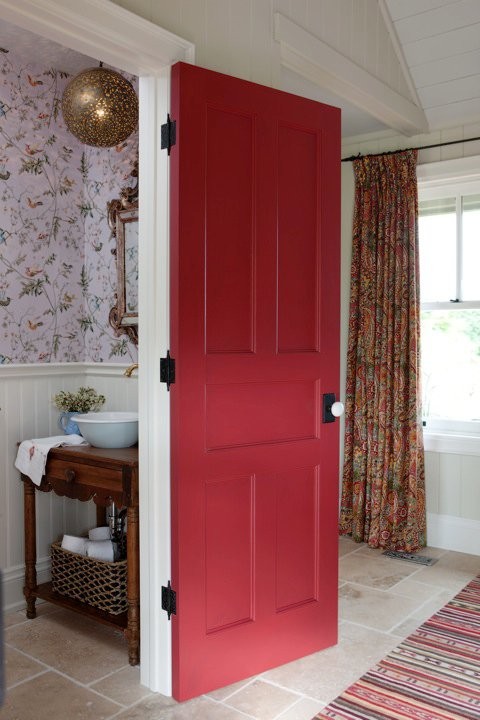
I found a large number of red exterior doors, but red works equally well on interior doors as Sarah Richardson proved in one of her many makeovers.
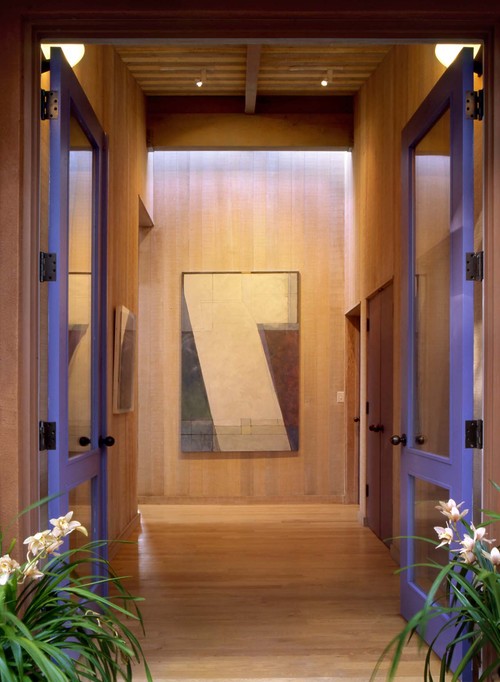
We don't often think of purple when we are trying to come up with a hue that goes well with most wood tones, but it does.I love the splash of colour with this basically wood toned room. Can you have too much wood? Yes, in my opinion, no happens to be my husband's take on this much debated question in our home.
Paint a stripe
Emily Elizabeth Interior Design
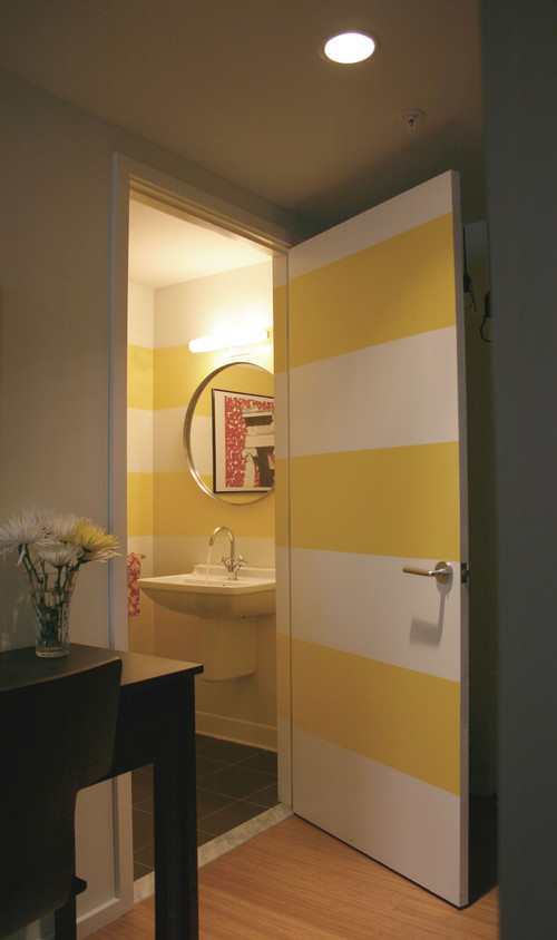
I like the way the stripe on the wall is extended across the door and the door trim. You have to really love stripes for this application. I want to close it and see the full effect. Interesting and fresh.
Paint the detailing
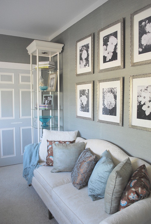
Sometimes painting details can create a fussy and cluttered look. That is not the case in this room because of it's very neutral palette.
Add trim
Gauhar
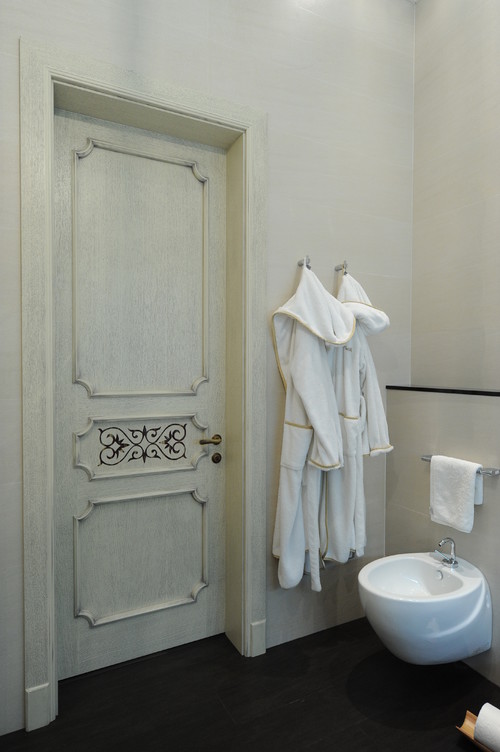
This more traditional look can be created by gluing (construction adhesive) ready made trim to plain doors. All you need is a miter box and saw. You won't get the lovely curved corners, but everything else is possible.A stencil can produce the design in the middle panel.
Use wallpaper
If you have a door with a recessed panel or a plain slab (hollow core) door you have many options to use wallpaper to embellish it. The trick is to integrate the door into your decor in a seamless way. This is an idea that could go very wrong and look absolutely cheap. Keep your wallpaper colour the same as the wall colour for best effect.
Add 3 D detailing
Using upholstery tacks can create very interesting door detailing. If you like to cross stitch this is the door idea for you! I can't imagine being this repetitive but to some it's a pure form of meditation.
Nail head trim can be a great solution for decorating a plain door. You can make the door colour colourful or dark. Depending on the colour you choose to paint the door, this look works well in a den/ study or boy's room.
That's a quick roundup of great DIY door solutions. Hope you found one you liked.
Subscribe to:
Posts (Atom)


